By Yuma Tanaka
Rox was founded on Valentine’s Day 2024 with the goal to empower the best revenue teams.
In the early days, we partnered closely with some of the most innovative technology companies. They weren’t just customers - they were collaborators who helped shape both our product and our culture. Those first partnerships defined the way we operate: fast, bold, and challenging the status quo.
But in less than a year, things changed. Rox grew from working with early adopters in tech to serving Global 2000 companies around the world. Every impression matters more than ever to build the trust, earning the right to power the world’s revenue teams.
The team and product functionality quickly grew to meet the needs, but one part still needed to evolve…
The first impression.
The origin
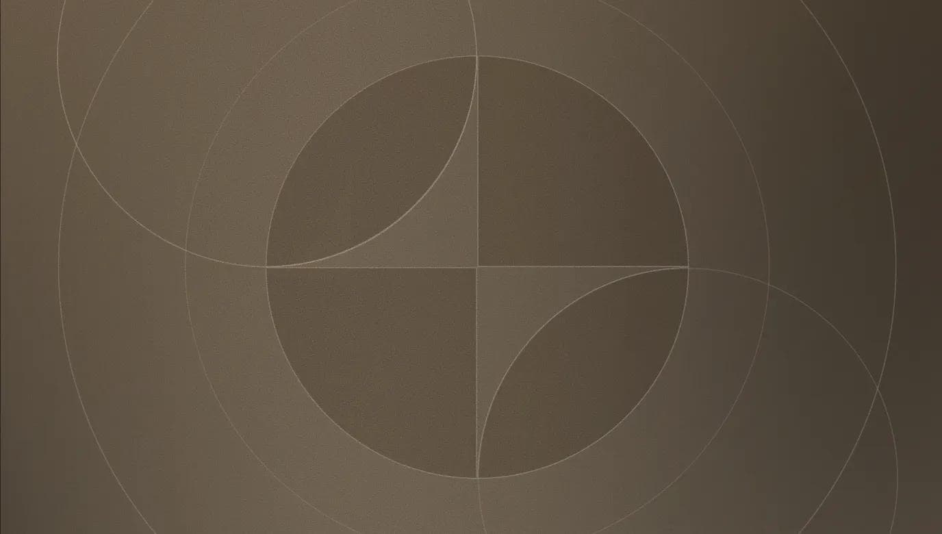
When Rox launched, our brand was built to stand out.
The vivid gold color was intentional - a signal of ambition and energy of the team. It was designed to catch your eye. Paired with sharp edges and geometric forms, the goal was for early believers in the product to feel empowered as they deployed Rox agents to augment their workflow.
That first identity fit us perfectly. We were a young company fueled by experimentation, partnering with early technology adopters who wanted to move just as quickly as we did. The brand wasn’t polished or restrained - it was confident, loud, and unapologetic.
It represented exactly where we were at the time: a scrappy team finding its stride, unafraid to take risks, and moving faster than anyone thought possible.
The process
As Rox entered a new chapter, we recognized that our brand needed to evolve to match the scale at which we were now playing at. The bold golds and sharp edges of our first identity reflected the energy of a startup - but now, serving Global 2000 companies, every detail carries even more weight. The brand had to inspire confidence at the highest levels, while still carrying forward the boldness that defines Rox.
After reflecting on where we are at in the journey, we anchored on three principles:
Supercharging the best sales teams - built to deliver outlier outcomes.
Enterprise-grade - architected for global scale.
Timeless elegance - designed to inspire confidence.
With this in mind, we had the incredible opportunity to work with some of the best in the field - and to bring the vision to life alongside our own team’s design engineering talent.
Gustav Ekerot (Rox) - design engineer
Ty Wilkins - brand design
basement studio - website design + development
Sona Dolasia - product design
Joseph Zhang - product design
iconwerk - icon design
Brent Clouse - animations
Translating the principles into a brand meant asking a deceivingly simple question:
How should someone feel when they see Rox?
In close collaboration with Ty, we explored some concepts to visually convey these concepts:
How could the brand embody that partnership?
We explored visuals that emphasized duality: human and machine, working side by side. This route leaned into interconnected forms and mirrored surfaces, depicting flow and co-creation. It was a powerful reminder of our belief that AI should feel like a teammate, not a tool.
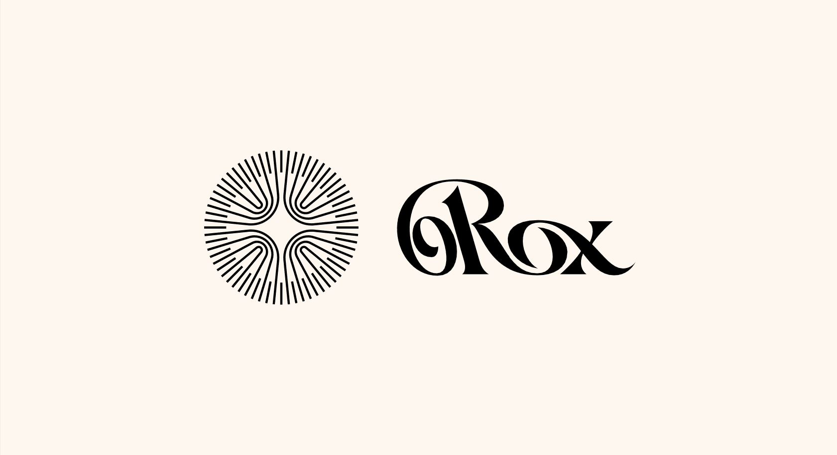
The first direction centered on collaboration between the agents and customers. Rox has always been about enabling people - not replacing them.
How could the brand embody that partnership?
We explored visuals that emphasized duality: human and machine, working side by side. This route leaned into interconnected forms and mirrored surfaces, depicting flow and co-creation. It was a powerful reminder of our belief that AI should feel like a teammate, not a tool.
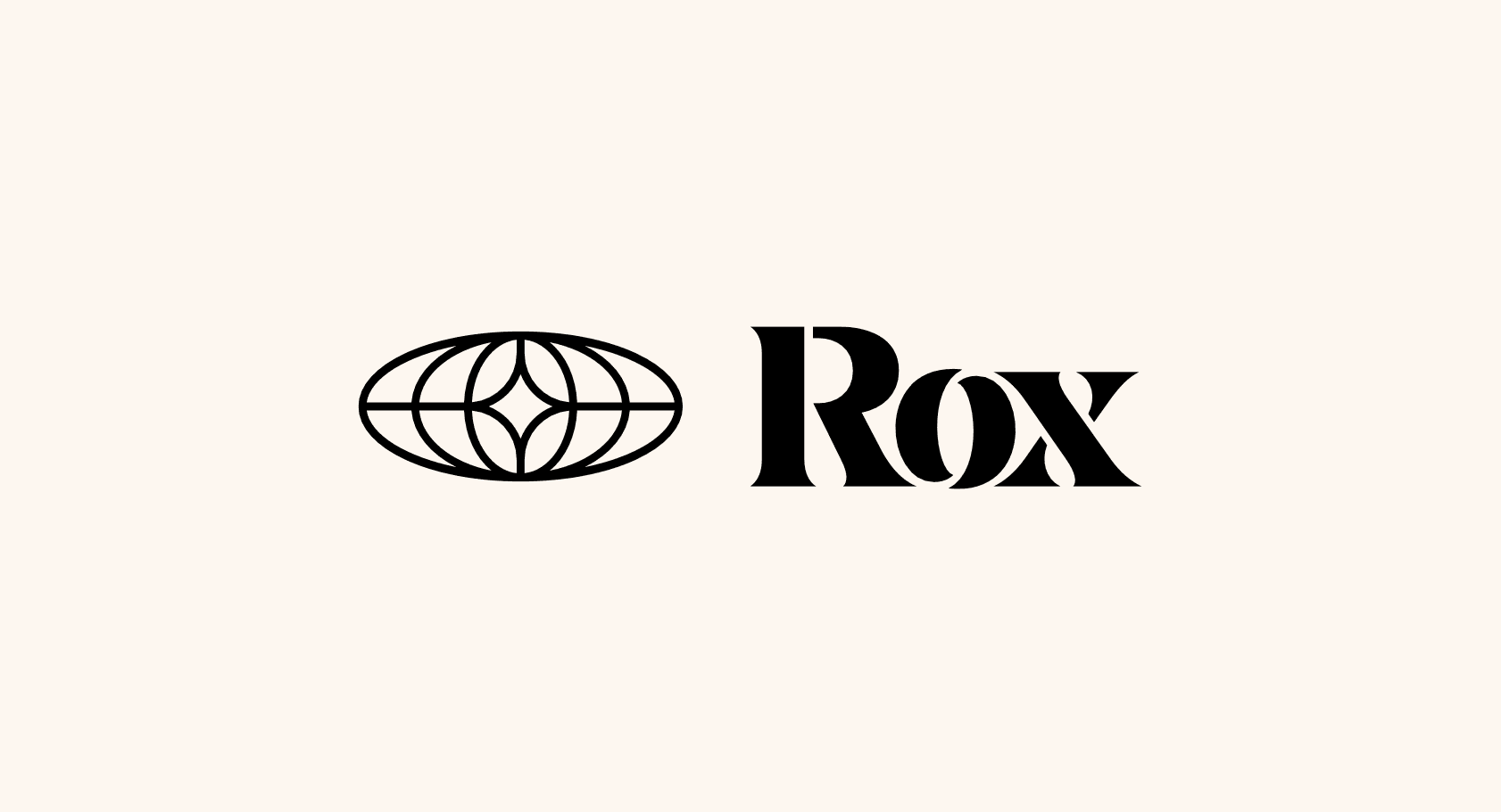
The second direction centered on themes of trust, stability, and monitoring at a global-level. Rox is built for the world’s largest enterprises, entrusted with the performance of entire revenue teams.
How could the brand embody that confidence?
We explored visuals that conveyed order, vigilance, and scale. This direction was composed of a globe and watchful eye along with a bolder wordmark, indicating that Rox is always present and performing. It spoke to the kind of quiet confidence enterprises look for when trusting a platform with their most important operations.
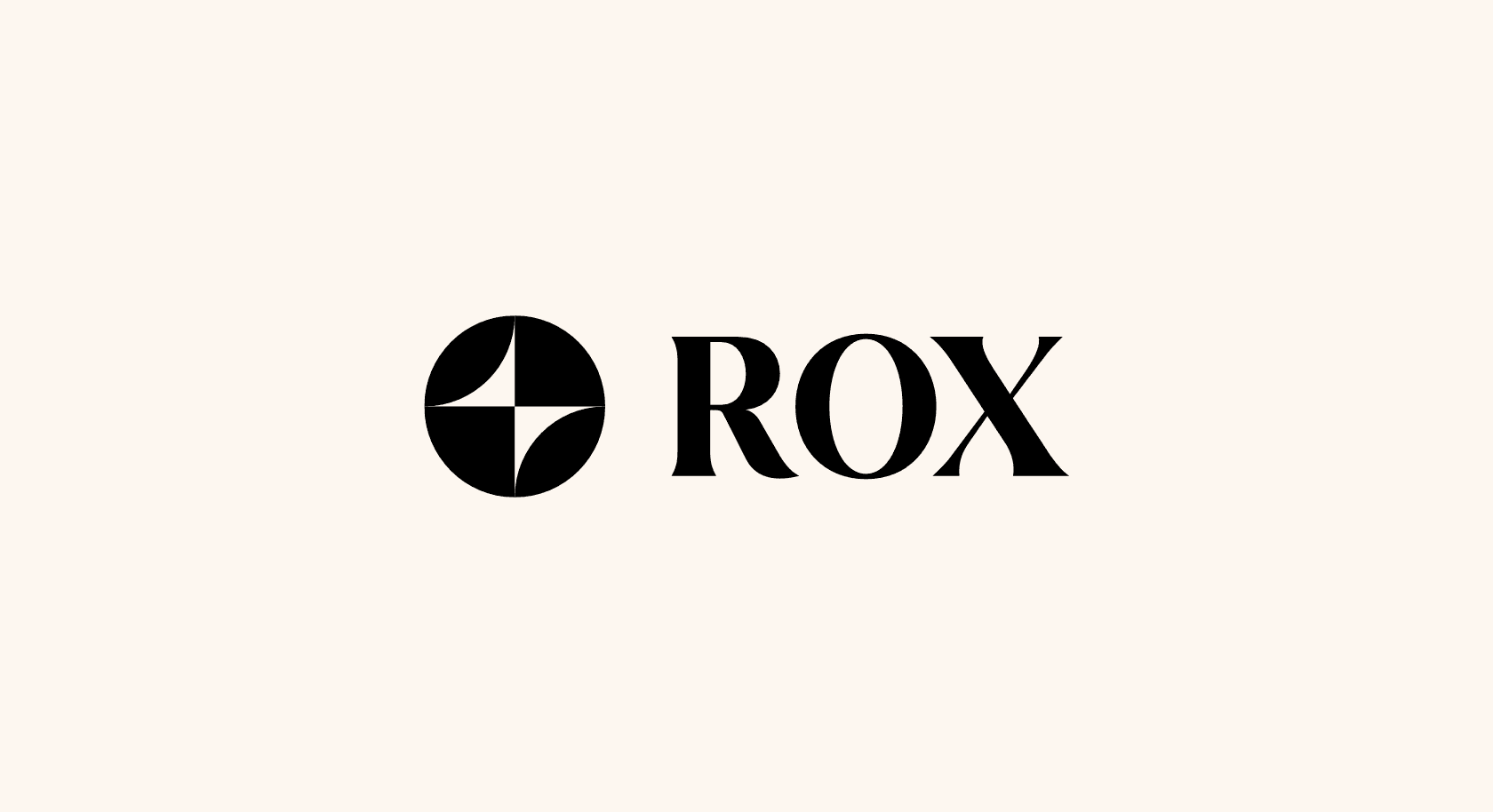
The third direction leaned into supercharging performance, almost magical in feel. Rox isn’t incremental - it transforms teams, amplifying the best to do more.
How could the brand embody that power?
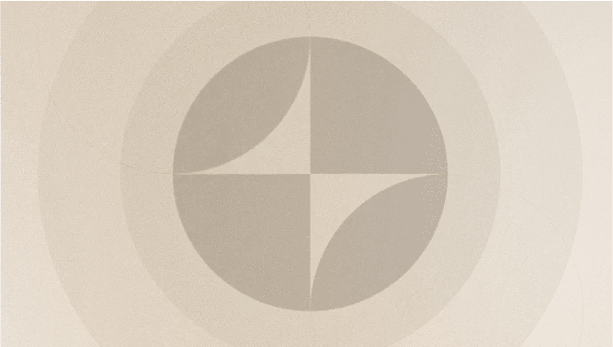
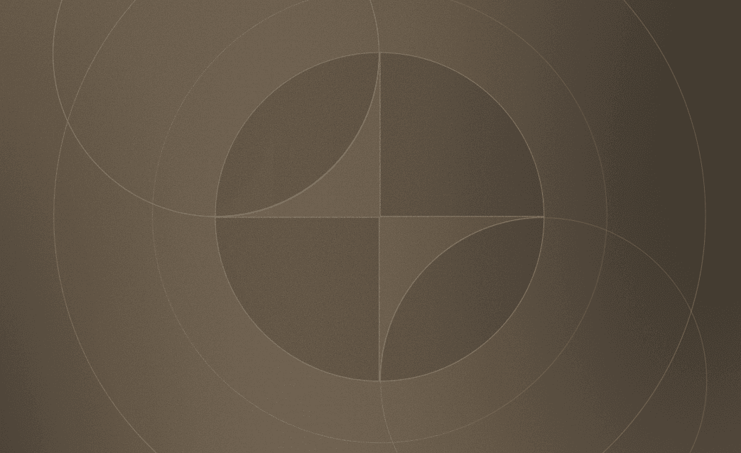
We explored visuals that reflected the transformation of teams to move faster while maintaining precision. This direction combined a lightning-bolt with an elevated wordmark, symbolizing Rox as a force multiplier. It showcases that Rox as both powerful and polished, helping revenue teams achieve more than they thought was ever possible.
The new chapter
We ultimately decided on the third option. Using this new brand as a guiding light, we elevated every aspect of the product and our brand presence.
Once again, a huge thank you to our partners for making this rebrand possible.
And thank you to our customers who push us every day to transform.
We ship new updates every week -if you’d like to help design the platform that runs the world’s best teams, apply here or reach out to us at hiring@rox.com.
Just a few of the many branding updates:
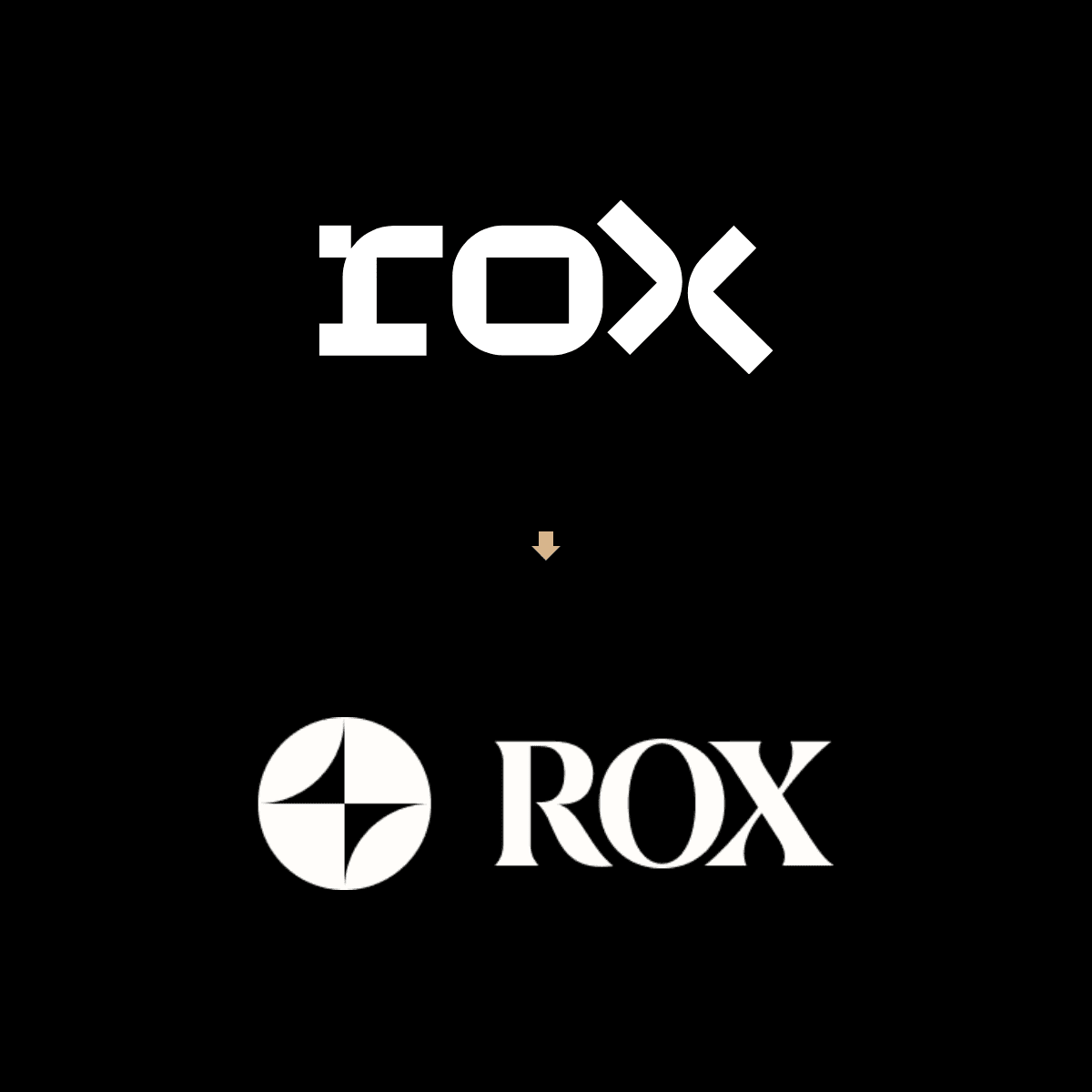
Wordmark

Website Homepage Animation
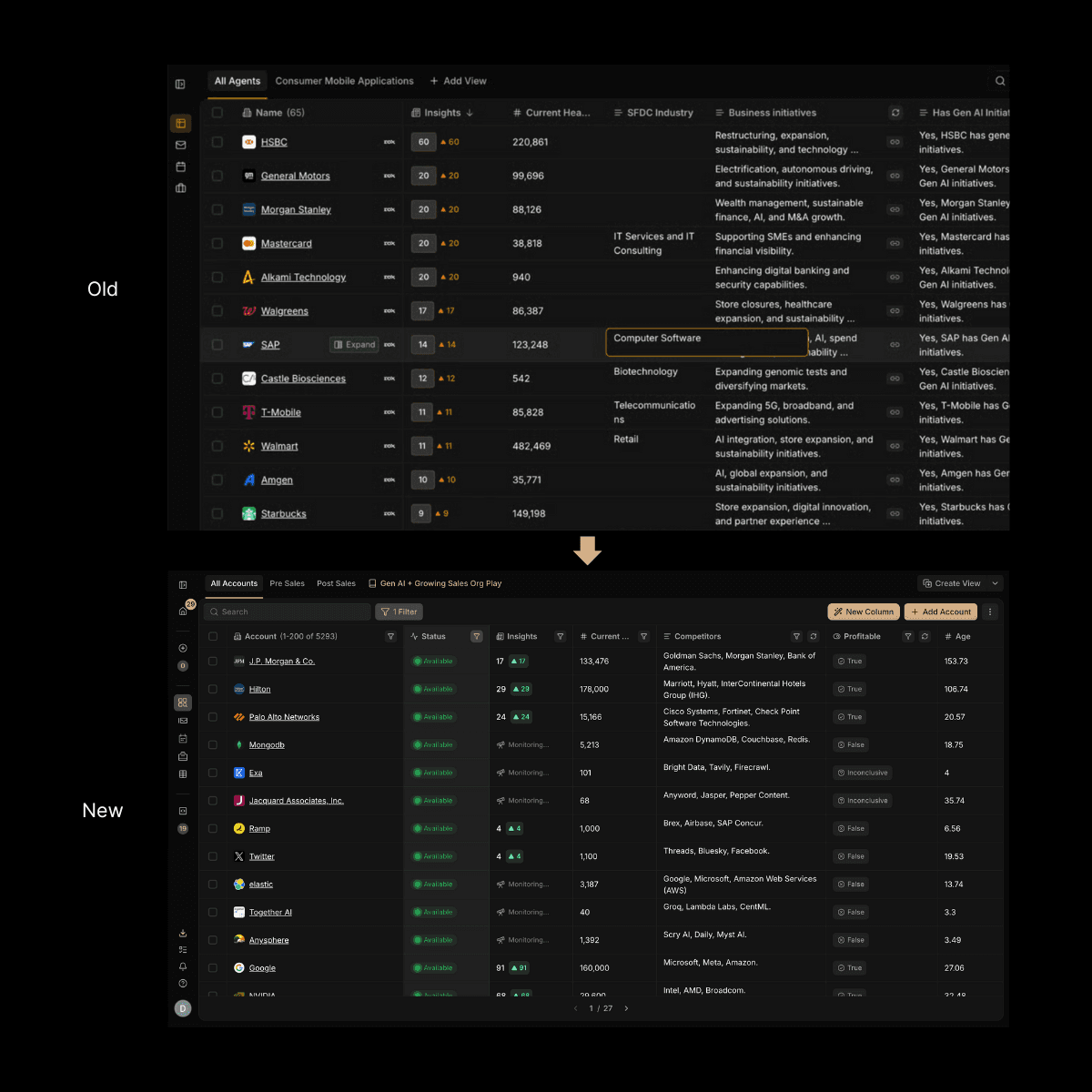
Research Interface
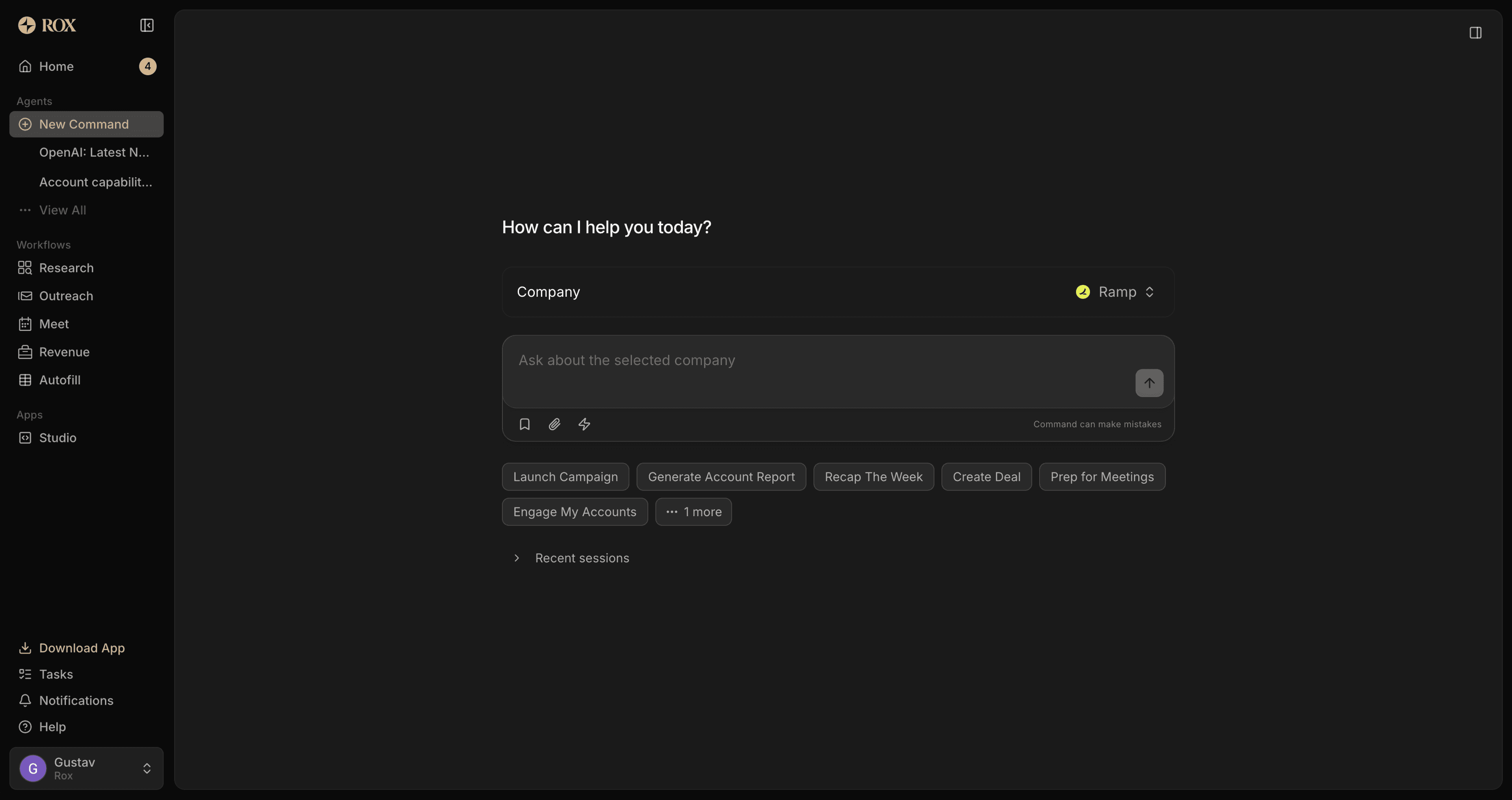
New Command Interface